15.09.2021
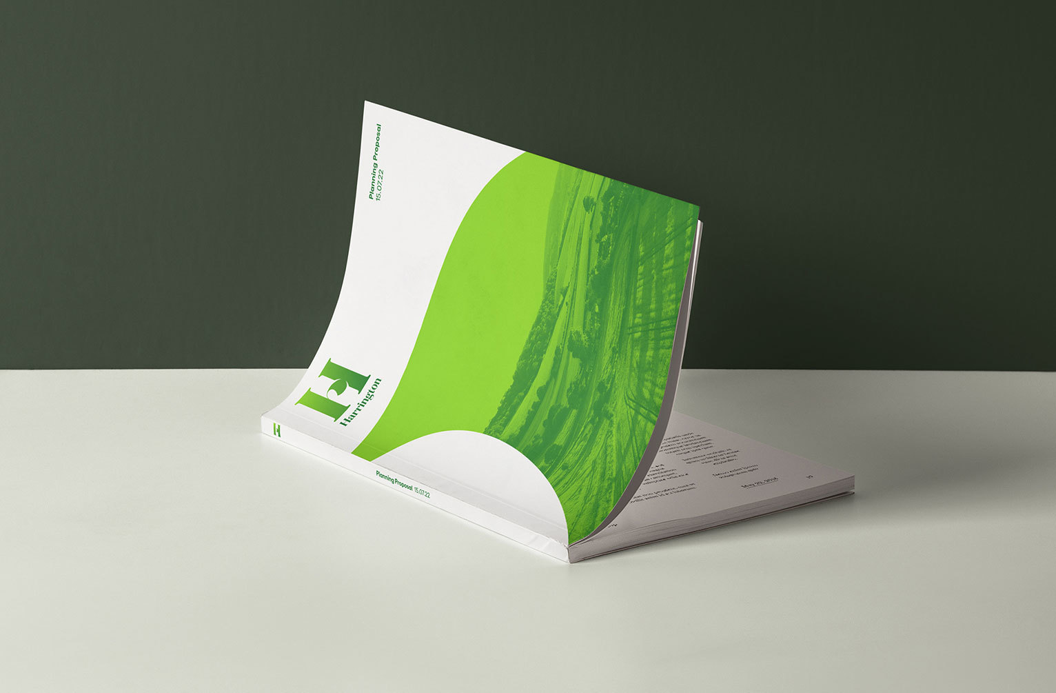
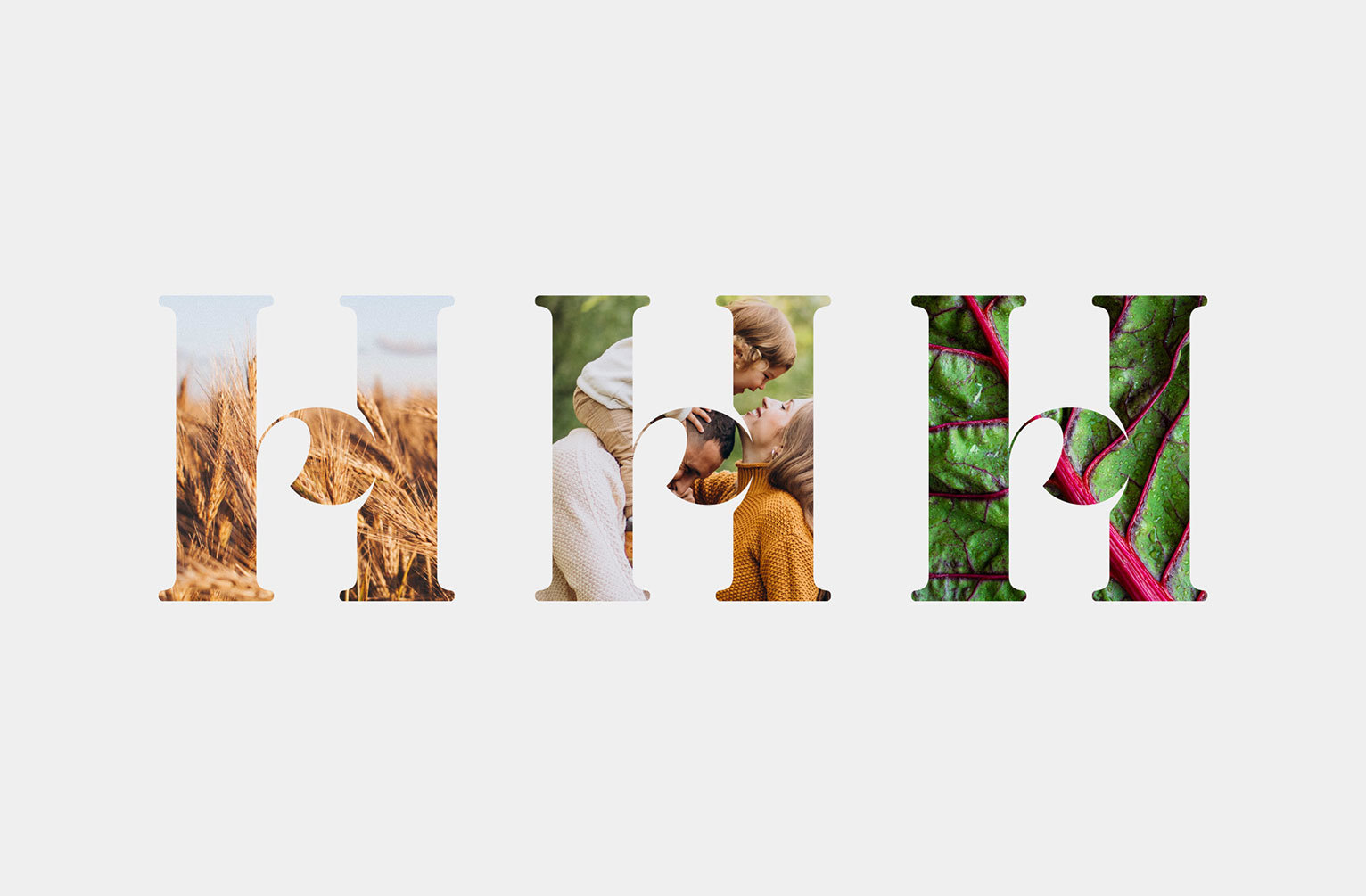
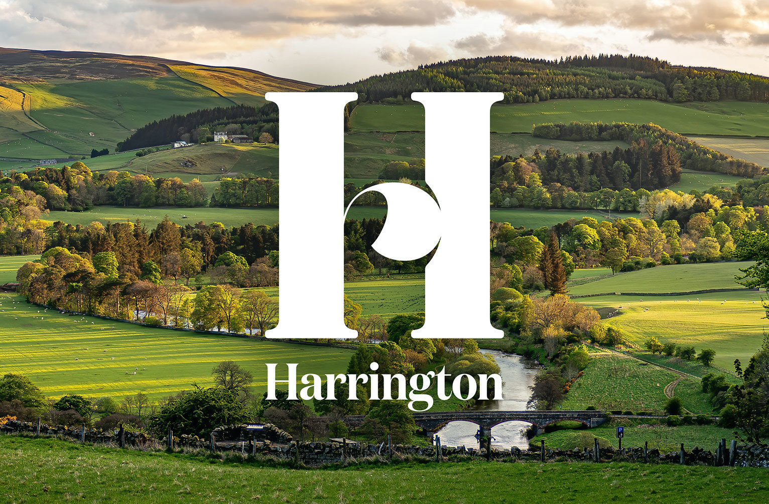
Aitch is for Harrington
We designed this confident identity for the Harrington town development in South Oxfordshire for our friends at MPC and Summix. Delivering 6,500 homes, four schools, leisure facilities, integrated transport networks and community farms, the ambitious Harrington development has been designed around sustainability and a harmony with nature; providing a blueprint of how we will all live in the future.
Elegant and authoritative in equal measure, the bold ‘aitch icon’ incorporates subtle organic curves to reflect the sustainability, biodiversity and low carbon ethos of the development. The supporting font echoes the curves within the icon, providing an open and approachable counterpoint.
We look forward to seeing the spade break the earth and the development come to life.